 Photo: Hint.fm.
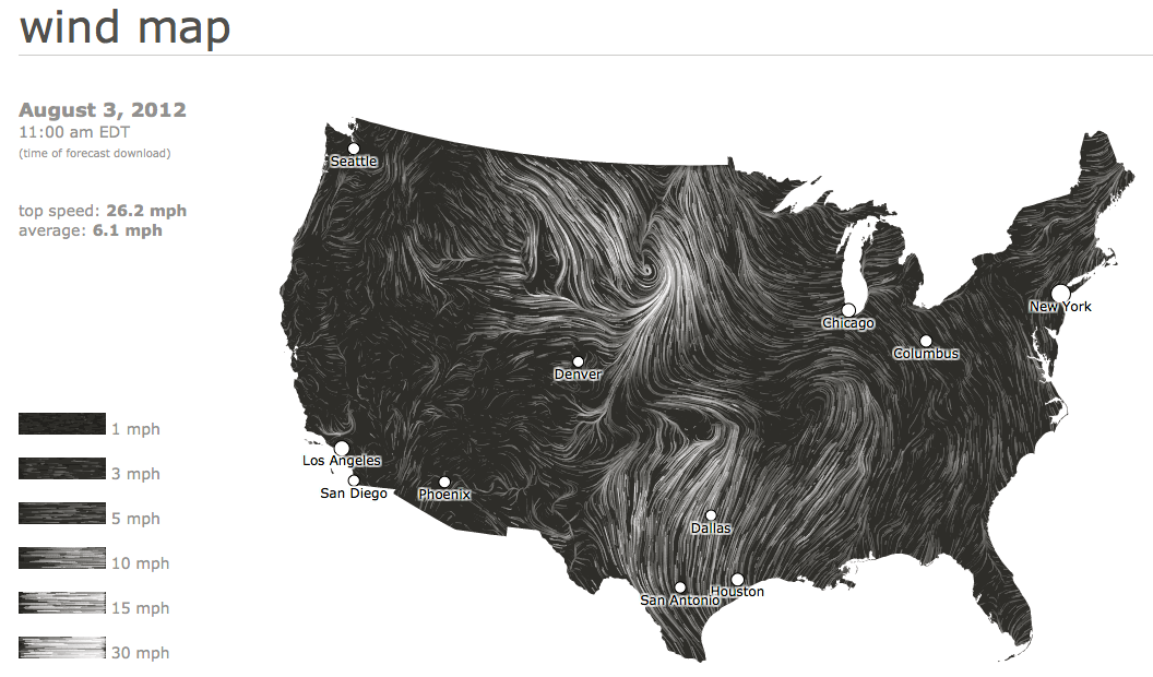
Two digital artists recently released an animated map illustrating the speed and direction of surface winds across the U.S.
It’s ever changing patterns are driven by wind data from the National Digital Forecast Database kept by the National Oceanic and Atmospheric Administration.
The database also feeds information to the administration’s Great Lakes current map released last month to help the public better understand lake currents.
Unlike the water current map, the wind map is not affiliated with the federal agency.
Visual collaborators Fernanda Viégas and Martin Wattenberg warn the data is not reliable and that no one shouldn’t use it “…to fly a plane, sail a boat or fight wildfires.”
They refer to the wind map as a personal art project. “We’ve done our best to make this as accurate as possible, but can’t make any guarantees about the correctness of the data or our software,” they wrote below it.
The map only shows short-term wind forecasts and it is updated every hour. In the left-hand corner viewers can see the date and time of the most recent forecast and the average and top wind speed.
More detailed information on national wind speeds can be found on the database’s website.