
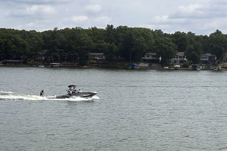
Wake boats make big waves, bigger clashes on Michigan lakes. Time for limits?
|
By Emilio Perez Ibarguen
Homeowners and environmental groups are pushing for reforms to restrict
wake boats to deeper areas far from shore, aligning Michigan law with existing guidance from the
Department of Natural Resources. A handful of states including Maine, Vermont and Tennessee in recent years have passed laws limiting wakeboarding to specific areas or deeper waters, while a push to do so in Michigan last year was dead in the water in Lansing. Wake boat enthusiasts say they’re being scapegoated for a larger problem.
Climate
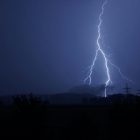
Michigan residents have surprisingly higher risk of being struck by lightning
By Clara Lincolnhol
Michigan experiences hundreds of thousands of lightning strikes each year and ranks 25th in lightning density per square mile, according to data from last year. Lightning strikes in Michigan are on the lower side of the scale because the state gets fewer storms than many others. But the number of people struck by lightning in the state is disproportionately high.
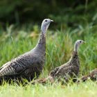
Wildlife
Michigan residents encouraged to report wild turkey sightings this summer
By Clara Lincolnhol
The Michigan Department of Natural Resources is asking state residents to report the number of wild turkeys they see this summer. The statewide survey will be used to get a sense of the turkey population to find out if baby turkeys are replacing adults. The survey, which runs through the end of August, asks residents to report when and where they’ve seen the birds in Michigan.
Climate
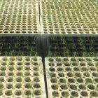
Can Michigan’s forests survive climate change? One researcher is finding out
By Emilio Perez Ibarguen
As Michigan’s climate warms, tree species like red pine and eastern white pine may no longer thrive here. Their native regions are moving north faster than forests can keep up with. That could have devastating consequences for Michigan’s $26.5 billion timber industry and rob the state of the ecological services the forest provides like carbon storage, water filtration and wildlife habitats. To help forests stand a chance, Michigan State University forest genetics assistant professor Jeremy Johnson is experimenting with “assisted tree migration.”